Back in November 2019, Facebook introduced a new brand Facebook Company with a new logo. That was rolled over with another new parent company, called Meta in 2021. Now, Facebook has become just an app, under the hood of Meta Platforms. Facebook app has now quietly introduced a subtle change to its visual identity, including a revamped logo that is barely noticeable at first glance.
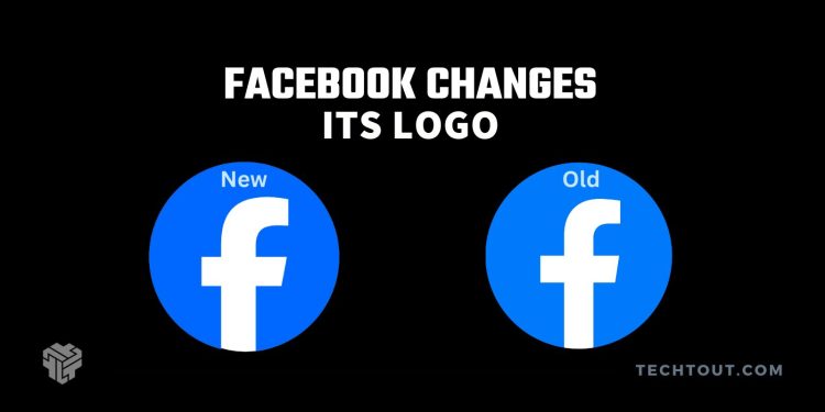
The social media giant, known for its blue branding, has opted for a deeper shade of blue with a new color code of #0765FF (RGB 7, 101, 255), replacing the previous #0179FA (RGB 1, 121, 250). This small change represents a deliberate shift as Facebook seeks to modernize and align its aesthetic with its evolving mission as said in the blog post.
Evolution of Facebook’s logo:

The revised logo, while maintaining the classic ‘F’ symbol, now stands out with its richer blue hue. The alteration is so subtle that many users may not immediately spot the difference. This strategic move allows Facebook to retain its familiar identity while symbolizing a new chapter in the platform’s journey globally.
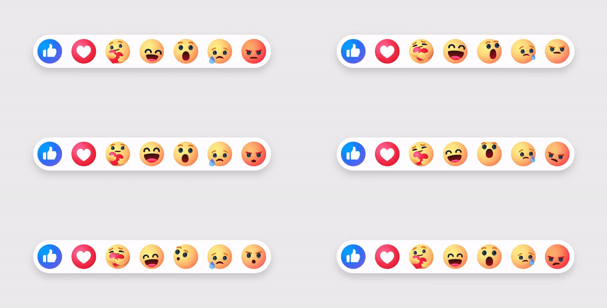
Beyond the logo transformation, Facebook has also introduced updates to its User Interface (UI) and reactions emojis. The refreshed UI aims to enhance user engagement and navigation, while the new reactions emojis adopt a friendlier and less feisty look.
New Facebook Reactions:

The reactions have undergone a noteworthy transformation as well. They’re flat but more brightly colored and less 3D. These changes are subtle but less aggressive.
As part of this overhaul, Facebook has also updated several icons, including Messenger, Notifications, Home, Friends, Video, Marketplace, and the Gaming tab. Along with these, the whole icons across the UI are getting an update in this first phase of redefining brand identity as mentioned in the blog post by Facebook. These modifications provide a modern visual experience for users across the globe. Facebook users can expect these changes to gradually roll out across the platform in the coming weeks.


![How to enable dark mode on Instagram [year] 13 2025 Instagram dark mode guide](https://techtout.com/wp-content/uploads/2023/01/dark-mode-instagram-120x86.jpg)
![Best Metal Gaming Laptops [year] 14 2025 Best metal body laptops on Amazon](https://techtout.com/wp-content/uploads/2023/05/best-metal-gaming-laptops-120x86.jpg)
![25 popular Linux distros [year] 15 2025 Most popular Linux distros in 2023](https://techtout.com/wp-content/uploads/2023/08/popular-linux-distros-120x86.jpg)
![Instagram story decoration Ideas in [year] 16 2025 A photo of a person using Instagram on iPhone, showing Instagram stories decorations](https://techtout.com/wp-content/uploads/2023/02/decorate-instagram-stories-120x86.jpg)
![10 Best Browsers for iPhone in [year] 17 2025 Best iPhones browsers](https://techtout.com/wp-content/uploads/2023/05/best-iphone-browsers-120x86.jpg)
![Top 9 lifestyle apps that will improve the quality of your life in [year] 18 2025 Lifestyle apps for IOs and Android users](https://techtout.com/wp-content/uploads/2023/07/top-lifestyle-app-120x86.jpg)


![11 Latest Instagram Tips and Tricks [year] 22 2025 high angle photo of a mobile](https://techtout.com/wp-content/uploads/2020/08/instagram-profile-scaled-1-120x86.jpg)


